Chartreuse#
Simple breakdown:
- A mix of 50% yellow and 50% green.
- Often known as neon yellow-green.
- Similar to lime-green or highlighter yellow.
- Very vibrant and eye-catching and become the color of safety vests.
- Wavelength at around 565 - 570 nm
Why “Chartreuse”?#
The name comes from “Chartreuse,” a french liquer made by Carthusian monks.
The drink has a natural yellow-green color, and the color was named after it.
There are 2 liquers:
- Chartreuse Green (strong, vivid greenish)
- Chartreuse Yellow (warmer, more yellowish)
Fun Details#
It’s considered one of the most visible colors to the human eye, which is why it’s used in safety gear. So designers use it when they want something high‑energy, fresh, or striking.
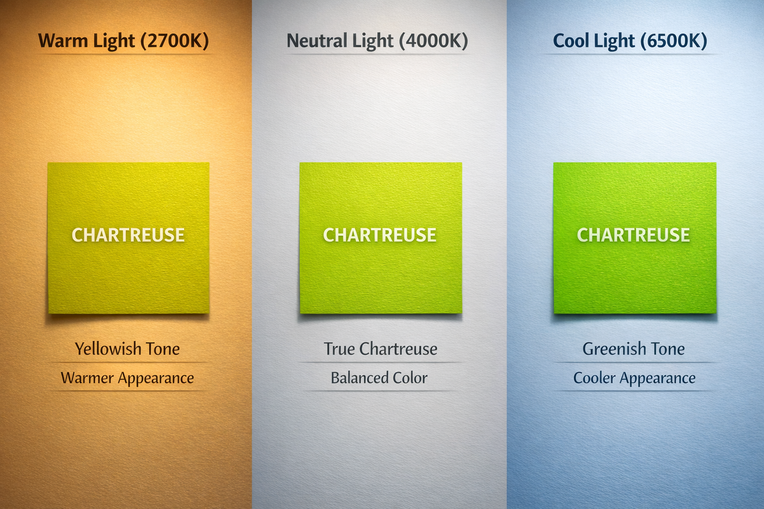
Colors Shifting#
Because chartreuse sits between yellow and green, it reacts very strongly to changes in light color. This means chartreuse is highly light-sensitive—more than pure yellow or pure green.
Warm Light (2700K - 3000K) contains more red and yellow wavelengths and fewer blue wavelengths.
- Chartreuse appears more yellow.
- Slightly softer and warmer.
- The green compoenet becomes muted.
- Look closer to lime yellow or neon yellow.
- Example: think of a yellow highlighter under a warm lamp → it becomes even more yellowish.
Cool Light (5000K - 6500K) contains more blue wavelengths and has a neutral to bluish-white tone.
- Chartreuse appears greener.
- More vibrant and crisp.
- Yellow part looks subdued.
- Example: imagine a tennis ball under daylight — it looks more green than yellow.
*** 🧠 Why? ***
Charetreuse = yellow + green
Warm light boosts the yellow but doesn’t boost the green. So our eyes receive more yellow reflection → color shifts warmer.
Cool light emphasizes the shorter wavelengths (blue/green). That boosts the green component of chartreuse → it moves toward a cooler green look.