Here’s a simplified spectral order and the position of chartreuse:
Violet  -→  Blue  -→  Cyan  -→  Green  -→  Yellow  -→  Orange  -→  Red
                                       ^         ^ ^
                                       |         | |
                                  chartreuse     | |
                                             13432 |
                                                   |
                                                Amber
Let’s focus on these 3 colors: Amber, 13432, and chartreuse.
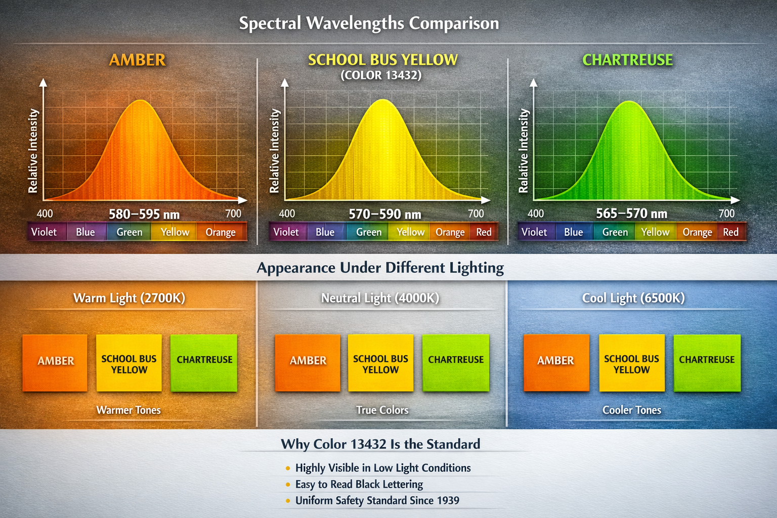
Spectral Wavelengths#
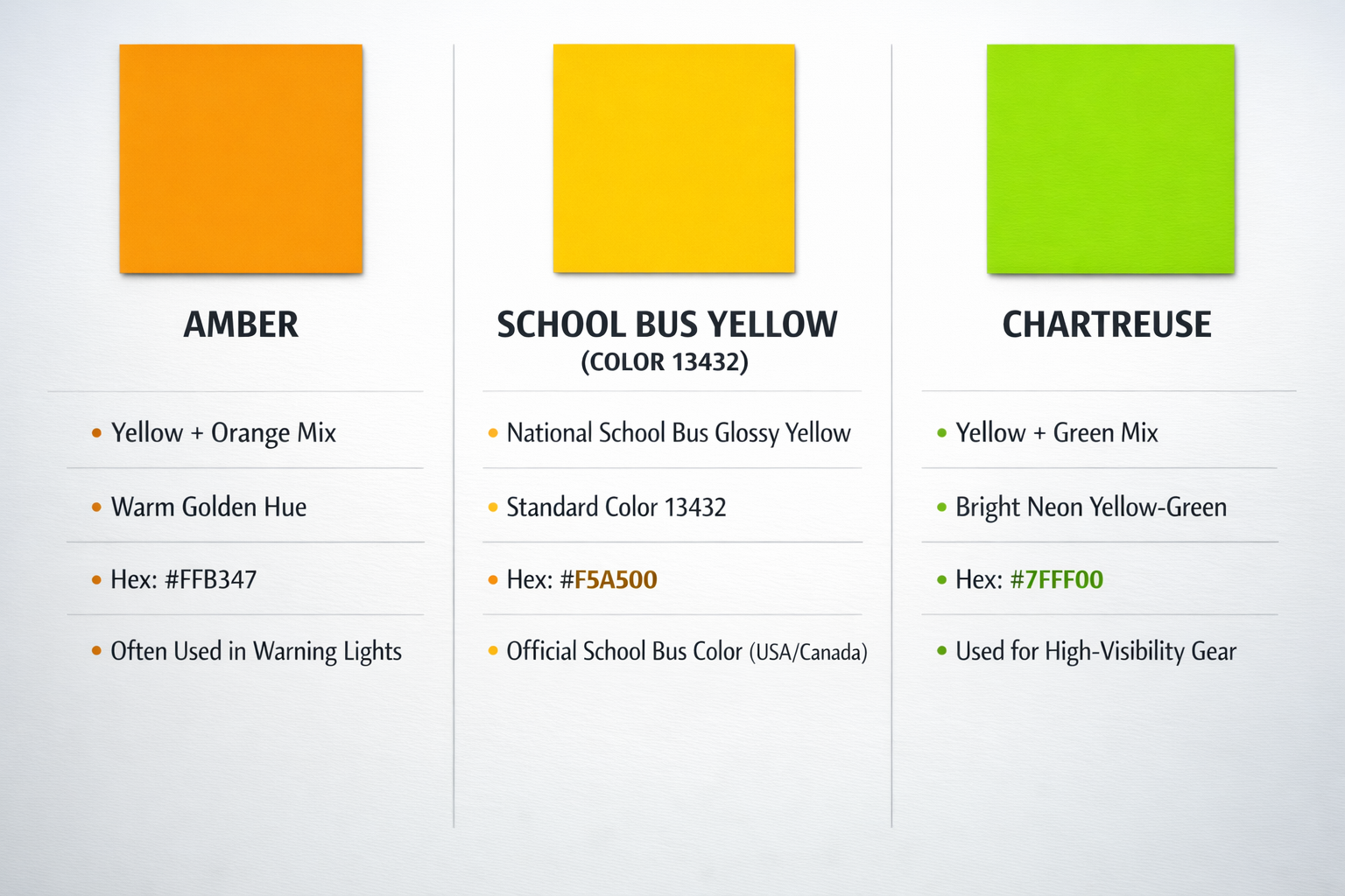
Amber (≈580–595 nm)
- Falls in the yellow‑orange spectral band.
- Strongly stimulates both red and green cones in the human eye.
- Longer wavelengths penetrate haze and low light more effectively.
School Bus Yellow — Color 13432 (≈570–590 nm)
- A precisely defined yellow‑orange hue engineered for maximum visibility.
- Officially called National School Bus Glossy Yellow.
- Sits at the sweet spot of human cone sensitivity, improving legibility in dim light.
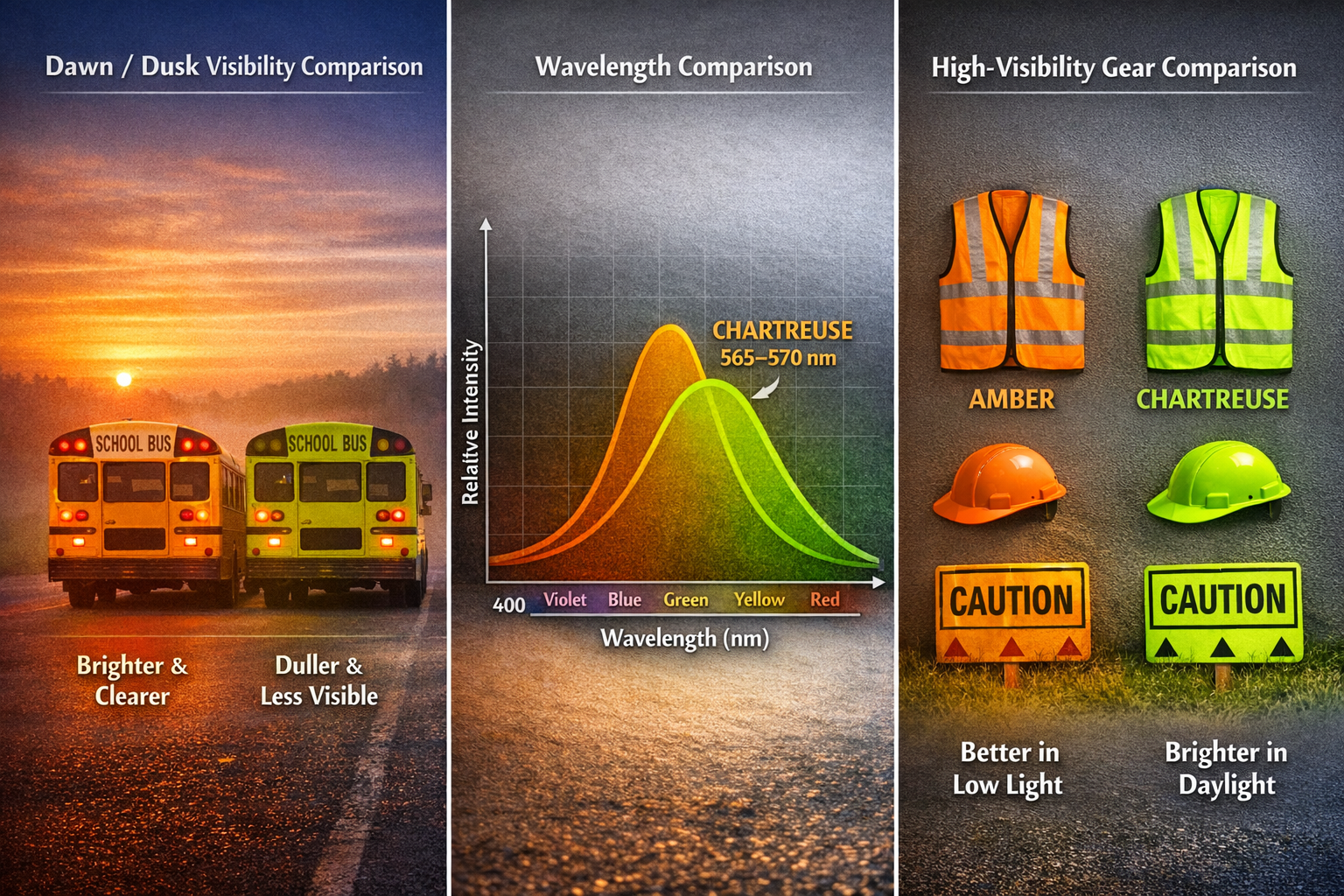
Chartreuse (≈565–570 nm)
- A yellow‑green color.
- Strongly stimulates green cones, but less effective at triggering red cones.
- Very bright in daylight, but reduces visibility at dawn/dusk.
Simulation Under Diff Lighting#
The simulation shows how each color behaves under:
Warm Light (2700K)
- All colors shifts slightly toward yellow/orange.
- School-bus Yellow (13432) remains stable and readable.
- Chartreuse becomes more yellowish and loses some contrast.
Neutral Light (4000K)
- All three appear closest to their true hues.
Cool Light (6500K)
- Chartreuse becomes greener and more vibrant.
- Amber becomes less dominant.
- School-bus Yellow (13432) stays highly visible without turning too green or too orange.
This stability is one of the reasons why 13432 is a safety standard color.
Why 13432 is the Standard#
Here is the real‑world, evidence‑based explanation:
Highest Visibility in Low Light
School Bus Yellow is optimized to be:
- easily detected in early morning and late afternoon,
- visible through fog, haze, rain, and indirect light.
Chosen because it made buses more conspicuous during dawn/dusk when children travel.
Maximum Legibility for Black Lettering
Black text (e.g., “SCHOOL BUS”) is most readable on this specific yellow‑orange background. This was a deliberate design requirement in 1939.
Human Vision Sensitivity
Color 13432 sits in the middle of the peak sensitivity range of red + green cones, the two most dominant cones in the eye.
Result:
- Stronger perceived brightness
- Better edge detection
- Better peripheral visibility
Standardized for Safety Since 1939
The color was chosen at the historic national conference that established school bus safety standards.
Why Not Chartreuse?#
Even though chartreuse is bright, it is:
- less legible for text
- unstable under varied lighting
- less visible at dawn/dusk compared to yellow‑orange
- never standardized for transportation safety
13432 vs Chartreuse#
| Feature | 13432 (School-Bus) | Chartreuse |
|---|---|---|
| Position in spectrum | Between yellow -> orange | Between yellow -> green |
| Mix type | Yellow + Orange | Yellow + Green |
| Resulting hue | Warm, amber-like, golden | Bright yellow-green |
| Visibility | Extremely high visibility, optimized for human peripheral vision | Also very visible but shifts toward green |
| Official use | Mandatory for US/Canada school buses for safety | Used for safety vests, neon signs, high-visiblity gear |
| Pyschological impact | Warm, cautionary, attention-grabbing | Energetic, high-visility, more “neon” |
| Lighting response | Appears more orange in warm light | Appears more green in cool light |
13432/Yellow-Orange (School-Bus):
- Falls in wavelength range that strongly stimulates both red and green cones, peaking within human visual sensitivity.
- This makes it particularly visible at dawn, dusk, for, and rain.
- Chosen specifically for safety, readability, and long-distance visibility.
Chartreuse:
- Sits between green and yellow, closer to the peak sensitivity of human eye.
- Typically used for: safety vests, worker jackets, some emergency signage.
- But Chartreuse lacks the universal standardization and associated safety regulations that school-bus yellow has.
Why School-Bus Use 13432#
Even though chartreuse is extremely visible, it is not used for school-bus because:
- School-bus yellow has been standardized since 1939.
- The chosen yellow-orange provides maximum readability of black letters, strong visibility at dawn/dusk, and excellent peripheral detection.
- Chartreuse shifts toward green under cool light, and reducing reliability in varied lighting.